Thursday, March 19, 2009

Final Evaluation

We have started by choosing to make bullying posters and brochures. So, for the first week we investigated, for the second week, we made the posters and brochures, and this week, we are trying to get mr hitchman's approval to stick the posters around school. Finally today we got his approval. Ilhem and I worked extremely hard these past weeks, and we worked wisely. Next week, we are going to present our project which is about stoping bullying about school. There are alot of things that went well, like Pages (program) which helped us alot with making the brochures and posters. I think that we can improve on the brochures alittle, we could make it more eye catching, so that people would read it. I dont think that we ave anything to do differently because we worked very hard. Ilhem and I thaught that it would take only two or three lessons to do the posters and brochures, but we actually took 3 to 4 weeks, which is along time. We only had 1 difficulty and it was by getting mr hitchmans approval because we cant find him anywhere. We overcame this difficulty by putting the form in his inbox. We had alot of feedback from different teachers like Mrs. Suzan, Mr Hitchman, and Mrs. Blackburn, and they all told us how much they liked it.

Client meeting


Here is our project:

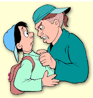
We did a poster and a brochure on bullying. In the poster, we wrote a message to stop bullying and to end it . we then put two pictures , friends hugging and the kids bullying and then wrote 4 commandants for not bullying. For the brochure, we wrote information on bullying , types of bullying, what to do if you are bullied and what to do if you see someone being bullied. in the page before the last, we put a bullying poem and on the last page we put a pictures.

Weekly Journal

Week 1-

We were introduced to this project. We chose to do posters and brochures. In this week , we did all the planning for the poster and brochures on paper. We drew the plan and scanned it to the computer and put it on the blog.

Week 2-

In week 2, we did the create stage. we made the poster and the brochure on pages. We investigated bullying websites and searched information and pictures for the posters and brochures.

Week 3-

In this week, we finished the posters and brochures and were ready and to approve to stick it around the school from Mrs. Blackburn. After we were approved, we got a slip for Mr. Hitchman to sign for us to make copies.

Saturday, March 14, 2009

create stage

After we finished planning the poster and brochure, it was time to actually create them. It was kind of hard to create the posters and brochures because we weren't used to Pages, but we managed to make them. After we finished doing our brochures and posters, we had to show Mrs. Blackburn or Mr. Hitchman to approve on us to stick them around the school. When we met with mrs. Blackburn, she told us to make a few changes like change the title. So, we went back to the classroom to make the changes.

Sunday, March 1, 2009

PLanning


Poster:

We will make a poster with a title and beneath it are 2 pictures, one with 2 friends hugging and the other with 2 boys fighting. Under the picture we will write: Which do you think is better? Then we will write five commandments for not bullying.


Brochure:

for the brochure, we will have a title of bullying beware of it. on the first page there will be a little paragraph about bullying. on the 2nd page there will be about about the types of bullying and the third page will have aboyt what to do if you are bullied and what to do if you see someone being bullied. on the page before the last will be a bullying poem. on the last page will be full of pictures. on the 3 first pages will be like a banner saying no bullying and 3 pics on top of it.

Sunday, February 22, 2009

Investigating Bulliying compare/contrast


Are they well designed?

the websites are well designed because they give good and helpful information about bullying. also, they put a relevant theme that suites the topic and good photos. It has alot of colours and is easy to read and understand.

Who is the audience? What is it intended for ?Where? How? are they used? What age group/audience are the games intended for?

Those websites were made to stop bulling and solve the problem.
i think that the audience was made for different ages.
this website i think was made for children.
this website was made for older children.
the games in the websites were made for small children aged around 9-11 years old.


Sunday, February 15, 2009


what is bullying? Define it? Define types of bullying?

A lot of young people have a good idea of what bullying is because they see it every day! Bullying happens when someone hurts or scares another person on purpose and the person being bullied has a hard time defending himself or herself.

There is alot of type of bulling ,some are:
1- cyber bullying is to say hurtful things and post photos bad on Websites, e-mails, cell phone text messages and photos to torment their classmates.
2- verbal bulliying is when a bully says bad words to the victim and makes fun of him and his family.
3- physical bulling when a person spread rumors on another person or makes him/her dose something he dosent want to do.


The reason why one kid would want to bully another kid is this: when you make someone feel bad, you gain power over him or her. Power makes people feel like they're better than another person, and then that makes them feel really good about themselves. Power also makes you stand out from the crowd. It's a way to get attention from other kids, and even from adults.


Saturday, February 14, 2009

Final Evaluation

1- How well does your product work? Does it do everything that you said it would do and does it do it well?

My product worked very well. It did everything i told it to do and it did it all well.


2- How well did you work at each stage of the design cycle?

step 1 - Investigate- the investigate step was some how the easiest step. it did not require alot of thinking and alot of steps.

step 2- plan - it was not hard it was just like the investigare

step 3- create- creating was the fun part because it was when you actually create it.

step 4- evaluate- i am doing it now.

Thursday, January 29, 2009

Client meeting


I have been making an i web on tsunamis and their effects. here is what i did so far:


1- Your design and layout of you web pages - Dose it fit your drawing/plan?

A 1- For my design and layout i used the theme Road trip, which is a wooden brown background with a piece of paper on top as a design and a place to write on. to be honest i didn't really follow my plan for the design. I used another type of design.

2- Your topic and reasearch - What have you done in class?

A 2- My topic was about Tsunami and its effect . I tried as much as possible to use kids websites for my research to make it easier. So, I did a detailed search of all the kid websites i can get. after i found the websites i needed and bookmarked them on delicious.


3- Color, font and the use of multimedia?

A 3- The font was the same for the writing and the information in the whole i web which was some how a kind of slanted handwriting with a grayish color which matched the lined paper background. The font for the title was comic sans , size 36 with a different color for every page. for the multimedia, i did one page that had a video of a tsunami. the rest of the multimedia was pictures, there was a picture in every page and all were different.


4- Dose it have 5 pages?

4- My iweb has exactly 5 pages, which is the minimum.


5- The features of Apple iweb. What is working ? and what is not working in the web application?

A 5- There are things in the application that are easy to use and find, for example changing the color and font. The harder things took a little while to understand and master lik, putting videos.

7- Do you have an emergency plan ? Do you have a reference page?

A 7- No i donnot have and emergency page or a reference page.


Saturday, January 10, 2009

Week 3

what did you like about the websites?

website 1 : red crescent website
The thing i like about this red crescent website is the color and text. the color is red and matches the topic and the text is easy to read and not alot of text. it also has a lot of visuals and multimedia.

i will compare this website with google. i thik that this website is better than google because it is more colorful . google is plain and boring with no color. Google dose not have alot of visuals and multimedia.